
HBO GO
Overview
GOAL
Design the HBO GO app for XBox that made viewing and discovering content easy
ROLE
UX Designer (Team of 3 UXers)
KEY PROBLEMS TO SOLVE
Create a single UI that accepted multiple inputs (Voice, controller, remote, mouse, Kinect gesture) while being able to be displayed in a variety of aspect ratios (XBox snap feature)
Enhance the viewing experience beyond just watching a show.
Wireframes were used to explore options that kept standards users would be familiar with (based on using the XBox) but still allow HBO GO to feel unique.


The Design
KEY SOLUTIONS
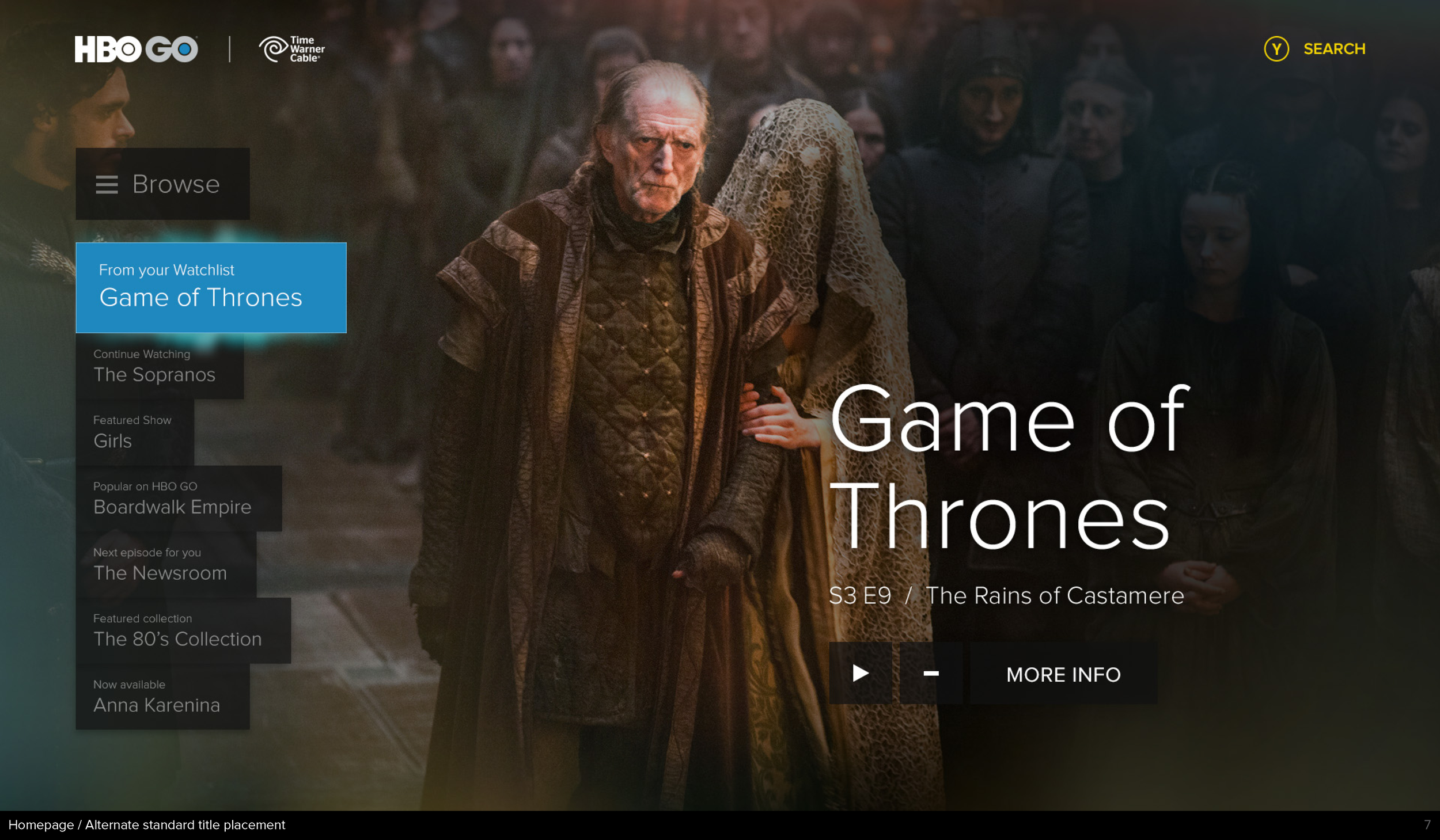
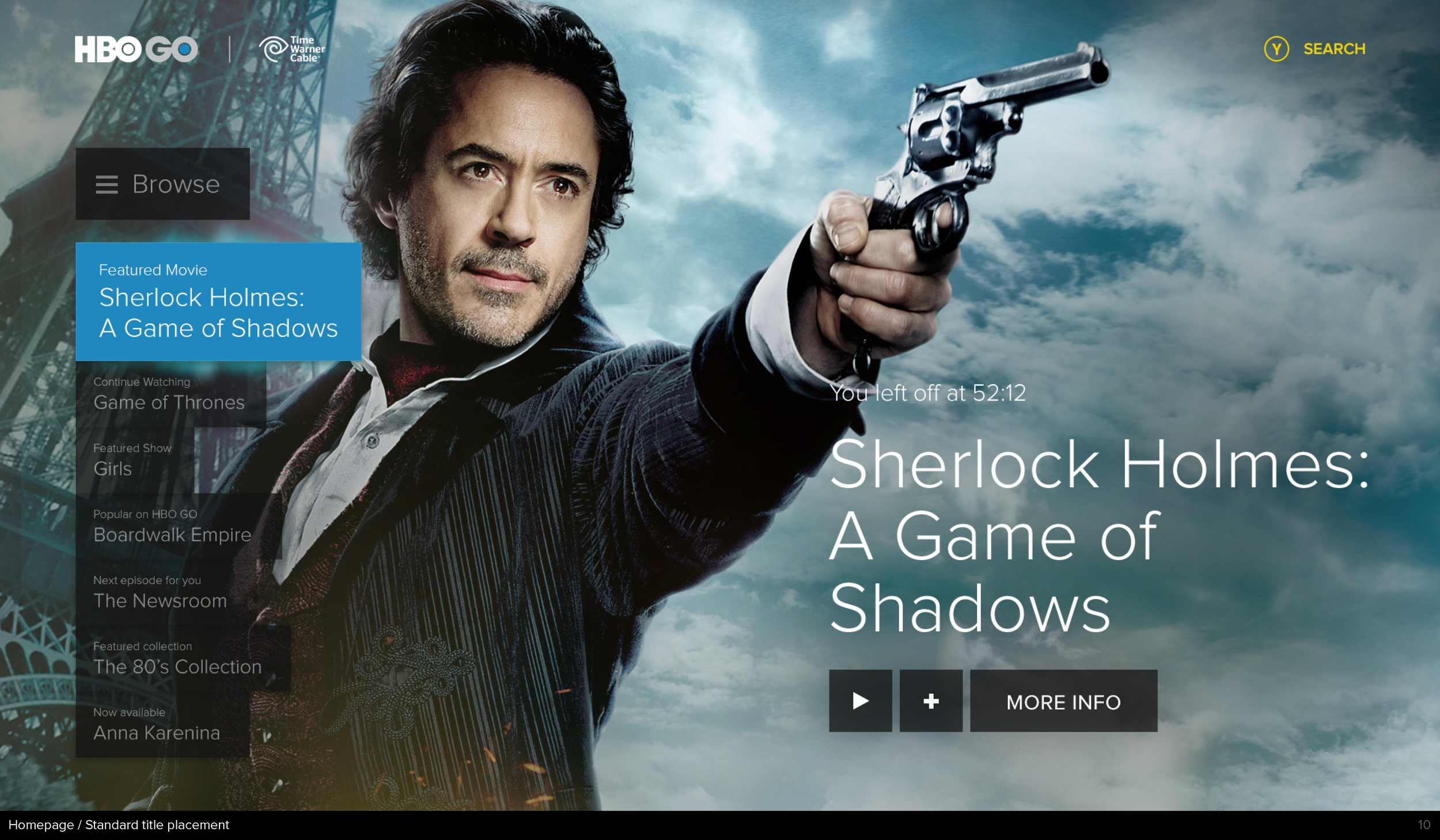
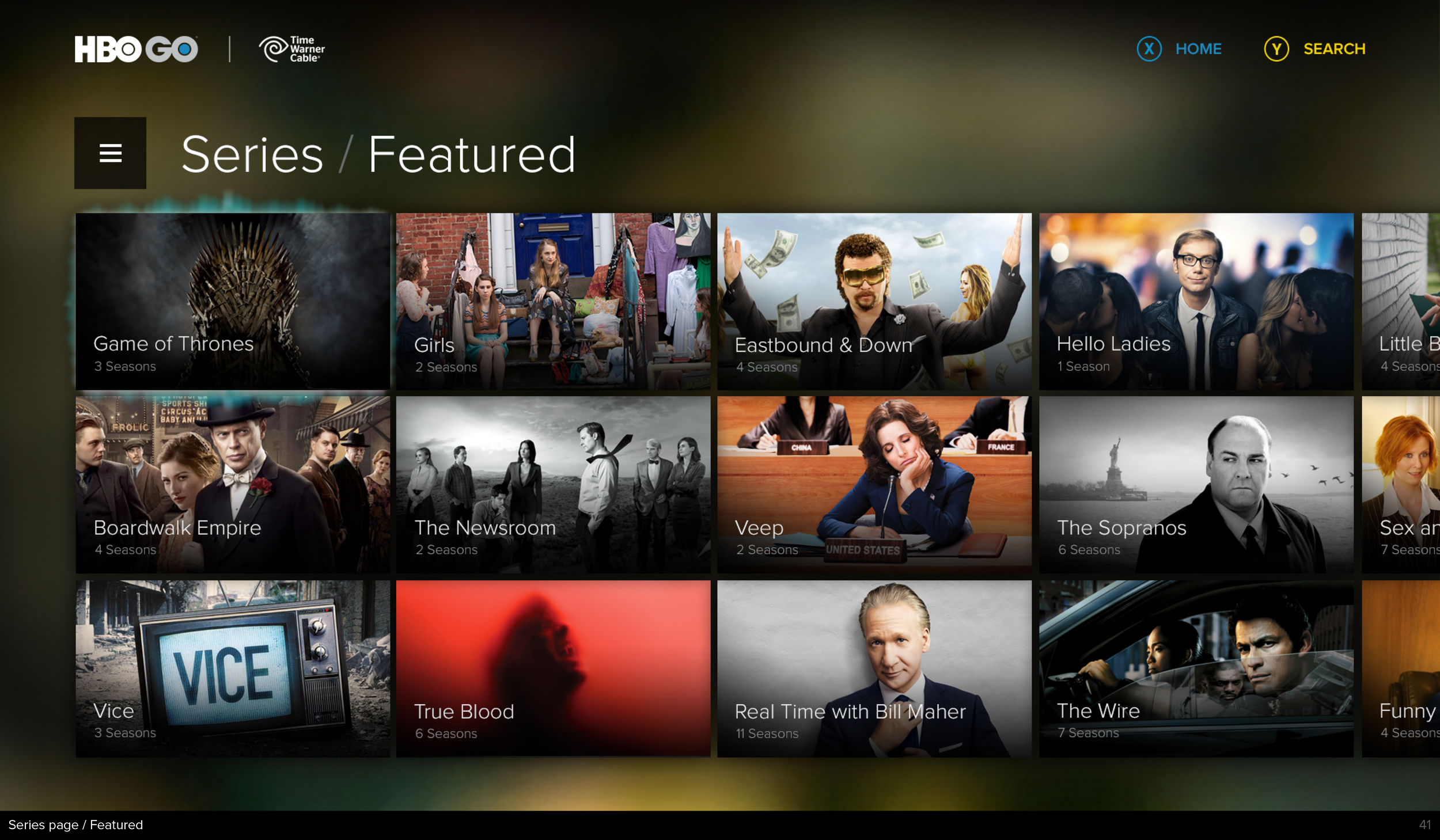
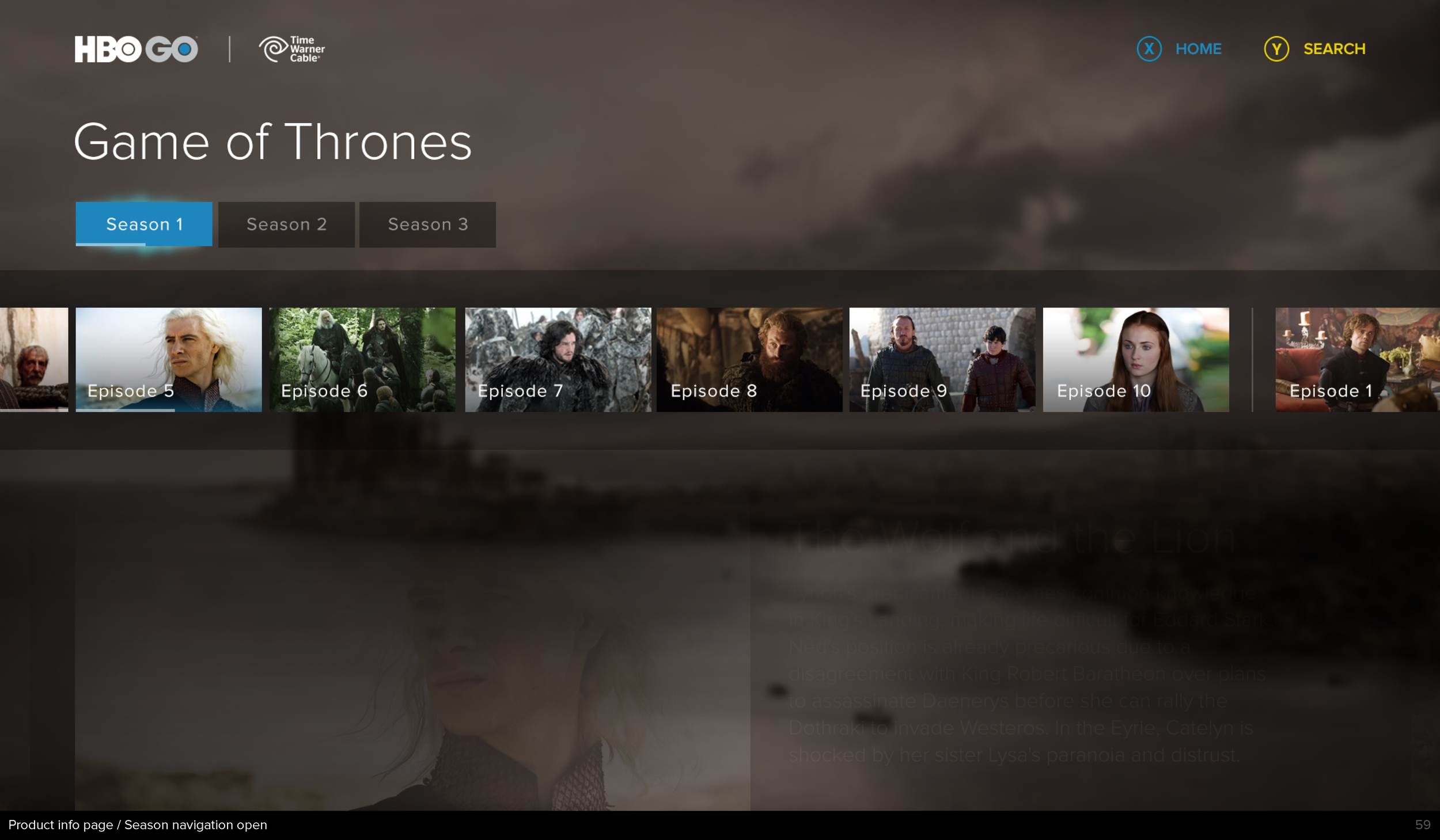
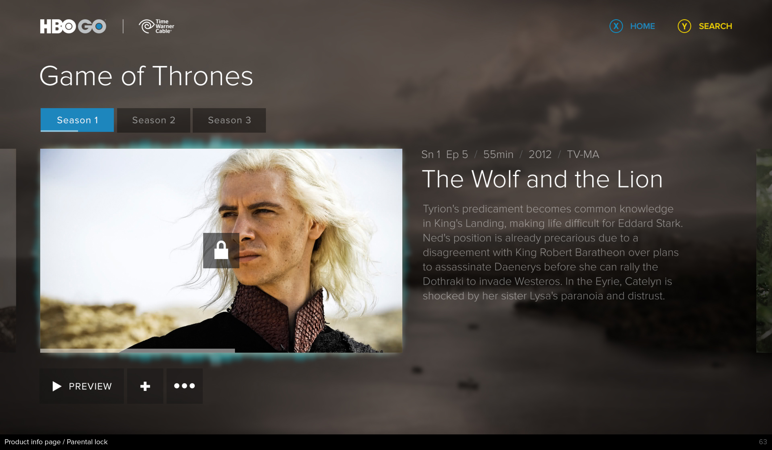
Simple navigation structure of menus and lists that grouped elements into rows or strips. This allowed more restricted input devices (controllers) to easily navigate the UI.
Made it easy to jump categories so users didn’t get stuck in a category. For example it would be a poor experience if a user pressed ‘right’ on a controller 10 times, they then had to press ‘left’ 10 times to get out.
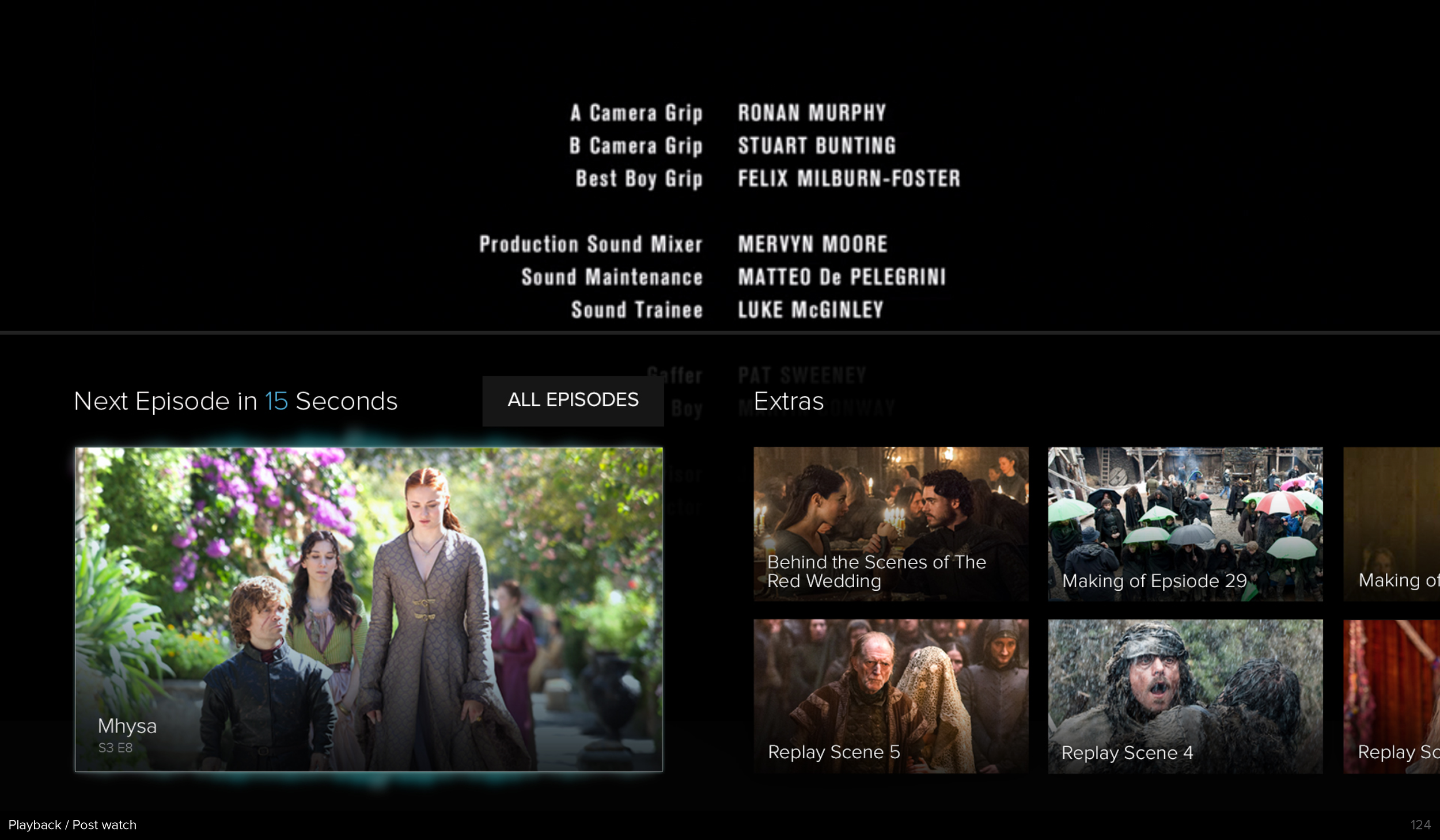
Shows are much more than just the episodes. Extra attention was placed on how extra content and show trivia could be integrated. making sure it was never disruptive to the experience.

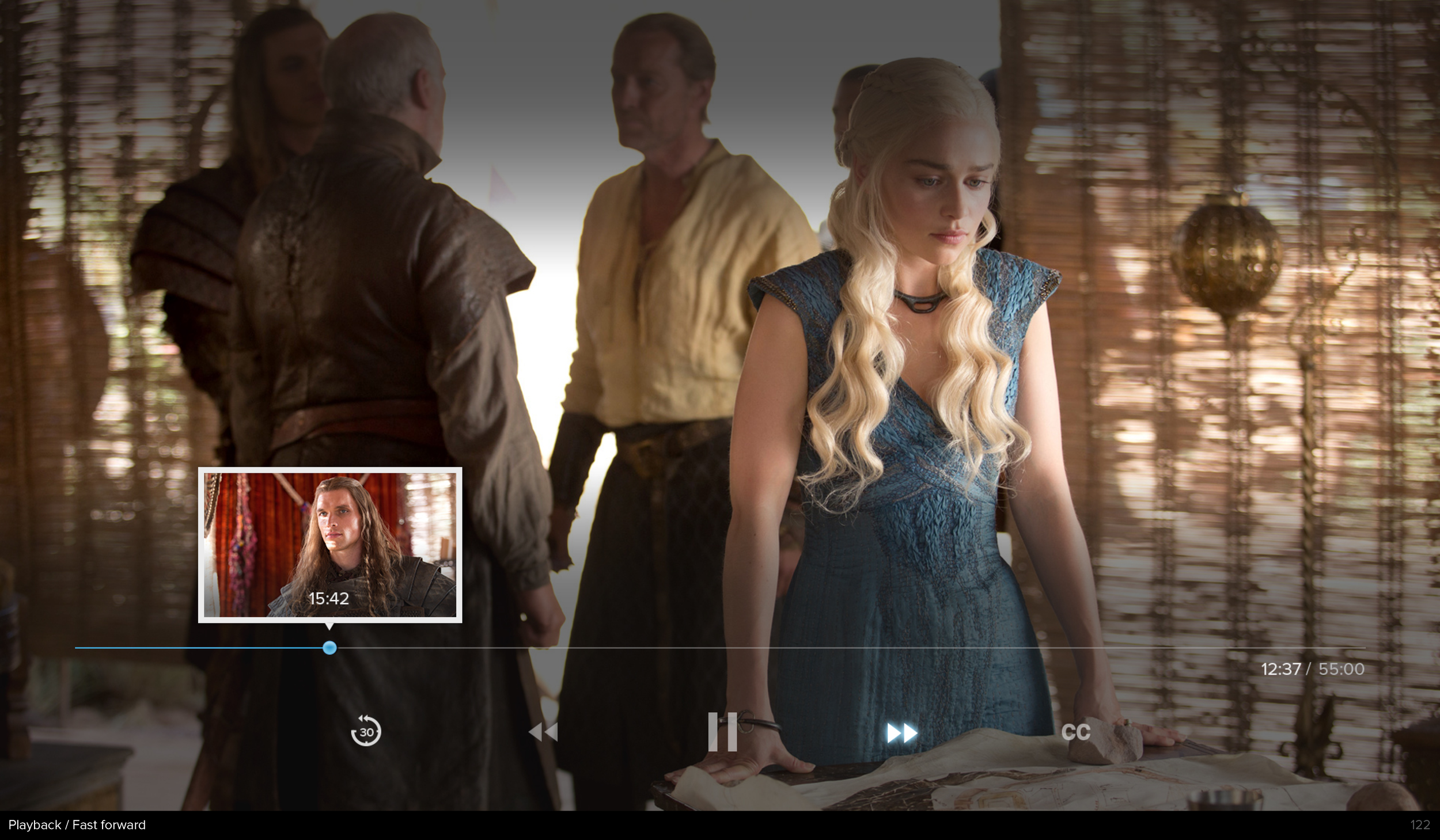
Users can pause the show or movie they are watching to get more context about that particular moment they are viewing.
Watching Game of Thrones and forget where a particular city is on the map? Forgot who a character is? The side bar provides context for that moment.
This is the interface shifted to voice input. Designs focused on labels that were easy to identify and say to navigate around.

Research drives good design
so here is a random fact
The term ‘footage’ originates from edited and shot film being measured in feet in the early days of film making.


